So I will state my thesis clearly: government spending is not out of control, it is quite simply too high.
Let me explain this further. I recently watched a presentation by John Stossel, a fellow Libertarian and true Patriot. However, during his talk he presented a historical graph of federal government spending while trying to make the point that our federal government has grown too large. I agree with him. I disagree with his methods of presenting the data.
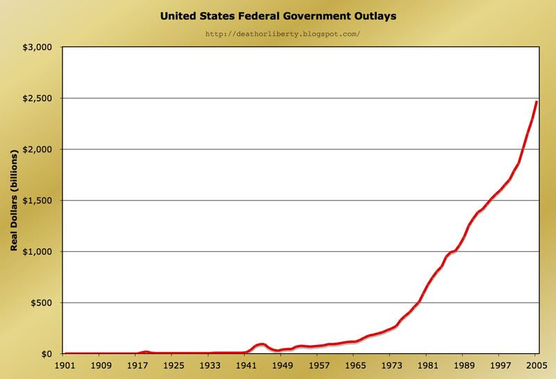
The first graph you see here is very similar to the one shown by John Stossel. It is a simple graph plotting total government spend each year. His point was that our government is out of control and increasing at an alarming rate, and the data certainly supports this. But there is one very clear giveaway that this graph is misleading, and it is something you should always look for when reviewing data. On a chart like this, the scales and limits of both axes need to be set so they are contextually relevant to the reader.
In this case, the horizontal axis is the year. This is contextually relevant; the reader can associate each year with their own lives. We can see that the chart starts in 1901 and ends in 2005, and these numbers have meaning to us.
The vertical axis here is total dollars spent; this has no relative meaning to most readers. It becomes very easy for the presenter to manipulate the visual impact of the data by changing the vertical limits, because we have no way of judging what these numbers mean to us. We can see that the graph approaches $2.5 trillion, but this gives us no indication of what that number should be, or could be. Since the number itself is meaningless to us, the data is not helping us to understand the issue at hand. This also allows misleading factors to be included in the data without notice, thus skewing the visual impact of the data even further. In this case, simply presenting total dollars spent means that population growth, inflation of the dollar, and total economic growth are all being ignored. These factors certainly affect total government spending. Additionally, the scale of the vertical axis is wrong. Because it is reasonable to expect total spending to increase over time (based on previously mentioned factors) the vertical axis should be set as logarithmic. In fact, if I had made that simple change the exaggerated curve now becomes a straight line, indicating that the growth is perfectly normal and not out of control.
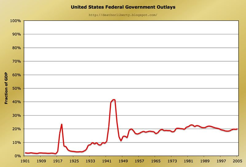
The second graph you see now is the exact same data as presented above. However, this time the total spend has been divided by the Gross Domestic Product for each year. Now, the reader is able to visualize government spending as a fraction of our total economic output. One can imagine that the upper limit of the vertical scale (100%) might represent a Totalitarian government while the lower limit (0%) might represent Anarchy. This provides contextual relevance to the vertical limits. Also, the vertical scale is now appropriate. It is reasonable to assume that changes in this graph are the result of spending policy changes and are not expected to change over time naturally. This makes the linear scale an appropriate presentation. I can imagine this revised graph now being very relevant to a political debate regarding the size and role of our federal government.
To summarize, we must always be aware of the scale and the limits of both axes when reading or presenting data. The numbers may be correct, but we need to consider both the accuracy of the numbers and the visual impact of the data when presenting honestly.
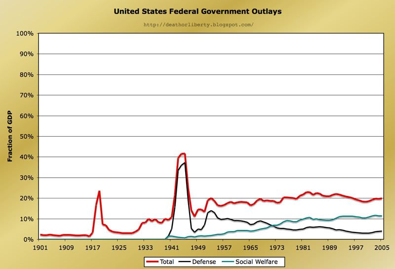
Now to take this a step beyond methods of data presentation, I'd like to discuss the size and role of our federal government for a moment. Referring to the third graph above, I've added two new lines to the previous data. Most people seem to think our government spends too much on the military, and there has been lots of data presented to prove that point. However, I contend that our real problem is the gradual shift in our socio-economic structure, from Capitalism to Socialism.
This country was founded on the principle of Freedom. This principle refers to both social and economic Freedom for all, which is the fundamental belief held by the Libertarian party. Over the course of our 230+ years, we have actually improved social freedom considerably. Even though the founders established this country with Libertarian ideals, they didn't initially apply to women or blacks for example. However, while we have improved in social freedom we have regressed in economic freedom. The above graph clearly shows that our government has taken on an increasing role in social welfare programs over the past 60 years. Meanwhile, defense spending has been steadily decreasing ever since World War II.
The ideals of the Democratic party are social freedom and economic control. Their goal is to control the economy through social welfare programs such that the social divide between the poorest and richest citizens is minimized. I contend however that economic freedom, that is allowing individuals to be responsible for their own welfare, will better achieve their goal in the long term. This is the philosophy of the Republican party and Libertarian party (founding fathers included) and I will attempt to prove this further in future posts.

3 comments:
You say "The above graph clearly shows that our government has taken on an increasing role in social welfare programs over the past 60 years", but that isn't really the most accurate description. The graph shows welfare spending increasing up to about 1983, and then effectively flat for the 22 years thereafter. No material change in welfare for decades.
Dear Anonymous, care to take another look now and rethink whether or not our bloggers post is now incredibly relevant to the events to date?
Here's where you go off the rails: Inflation is nothing but another form of government spending.
Post a Comment